

Available now

Available now
GoPro Quik app

Back
Mission
Led the video editing module of the GoPro Quik mobile app, designing it for non-professional editors with AI-powered features.
Client
Worked directly with CEO Nick Woodman to bring his vision to life, scaling the app from 500K to over 2M users by my departure.
Context
- GoPro acquired the French Quik app.
- Direct collaboration with GoPro's #1 and #2 executives.
- Team of 8 French developers across Android & iOS.
- 6 other designers in the US.
- UXR department based in the US.
Brice
”
For the GoPro Quik app, the primary pain point for users was navigating back and forth between media files and video editing menus.
Before,
While editing within a tool, users could not switch from one media file to another. They had to return to the tools list, then press a separate back button to reach the media selection screen, select which media to edit, choose a tool, and finally return to editing.
Brice
”
When loading heavy media files on a phone such as GoPro footage, minimizing reloads is crucial.
Despite significant technical constraints in restructuring the app's architecture, we successfully achieved a smoother UX.
Brice
”
After,
Based on all the feedback received, we implemented tested solutions incrementally, aligning with and adapting to the long-term UX roadmap.
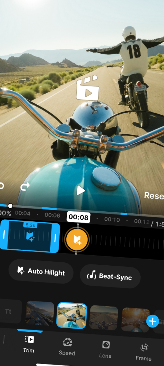
First, the "where am I" question was unclear in the previous UI. I considered it crucial to help users understand visually—without tutorials—what was happening with their media.
- Segmented timeline (same as “chapters” concept that YouTube and others did after)
- Zoom effect on the selected media segment within the global timeline during editing.
- Motion design on UI elements to understand what moves and what goes where.
To enable this smooth transition, we completely refactored the player and navigation codebase, affecting all editing tools.
Stakeholders were easily convinced: this was essential to compete with new entrants unburdened by our legacy constraints.
Major investment, major payoff.
_
We also added as needed the tool switching from the same media, and media switching from the same tool.
Brice
”

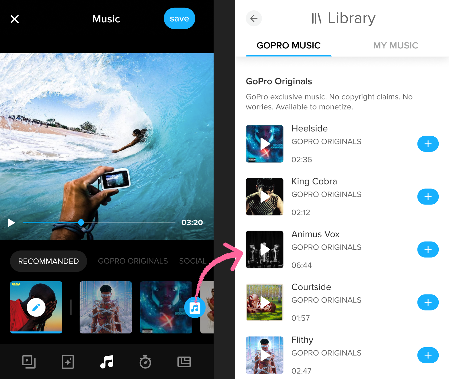
You can see in the screenshot below the old UI of the music selection, including the old nav .
Brice
”
The experience was notably poor without the ability to preview how the music would sync with the actual video playback.
Another pain point was music browsing. Without direct access to a Spotify library or similar reference, users were left with many unfamiliar tracks.
As a user, what criteria should guide my choice? How could I know what to expect? Should I test every track individually, waiting for each to load and play through to the chorus?
After,
- Added tags to be able to see what kind of music it is. I also pushed to add not only the genre, but the mood of the music, because there are many kind of rap song, for instance.
- Added filters to only see what you are looking for.
- Allowed an extented browsing drawer without loosing sight of the video.
- Access to the timeline to easily seek to the chorus of the music.

Available now

GoPro Quik app

Back
Mission
Led the video editing module of the GoPro Quik mobile app, designing it for non-professional editors with AI-powered features.
Client
Worked directly with CEO Nick Woodman to bring his vision to life, scaling the app from 500K to over 2M users by my departure.
Context
- GoPro acquired the French Quik app.
- Direct collaboration with GoPro's #1 and #2 executives.
- Team of 8 French developers across Android & iOS.
- 6 other designers in the US.
- UXR department based in the US.
Brice
”
For the GoPro Quik app, the primary pain point for users was navigating back and forth between media files and video editing menus.
Before
Before,
While editing within a tool, users could not switch from one media file to another. They had to return to the tools list, then press a separate back button to reach the media selection screen, select which media to edit, choose a tool, and finally return to editing.
Brice
”
When loading heavy media files on a phone such as GoPro footage, minimizing reloads is crucial.
After
Despite significant technical constraints in restructuring the app's architecture, we successfully achieved a smoother UX.
Brice
”
After,
Based on all the feedback received, we implemented tested solutions incrementally, aligning with and adapting to the long-term UX roadmap.
First, the "where am I" question was unclear in the previous UI. I considered it crucial to help users understand visually—without tutorials—what was happening with their media.
- Segmented timeline (similar to the "chapters" concept later adopted by YouTube and others).
- Zoom effect on the selected media segment within the global timeline during editing.
- Motion design on UI elements to understand what moves and what goes where.
To enable this smooth transition, we completely refactored the player and navigation codebase, affecting all editing tools.
Stakeholders were easily convinced: this was essential to compete with new entrants unburdened by our legacy constraints.
Major investment, major payoff.
_
We also added as needed the tool switching from the same media, and media switching from the same tool.
Brice
”

Another Pain Point: Music Selection
You can see in the screenshot below the old UI of the music selection, including the old nav .
Brice
”
The experience was notably poor without the ability to preview how the music would sync with the actual video playback.
Another pain point was music browsing. Without direct access to a Spotify library or similar reference, users were left with many unfamiliar tracks.
As a user, what criteria should guide my choice? How could I know what to expect? Should I test every track individually, waiting for each to load and play through to the chorus?
After
After,
- Added tags to be able to see what kind of music it is. I also pushed to add not only the genre, but the mood of the music, because there are many kind of rap song, for instance.
- Added filters to only see what you are looking for.
- Allowed an extented browsing drawer without loosing sight of the video.
- Access to the timeline to easily seek to the chorus of the music.
Brice
”
If you’d like to view additional prototypes or discuss any design decisions, please feel free to contact me.
email me
My resume
Available now