

Available now

Available now
SaaS Platform

Back
Mission
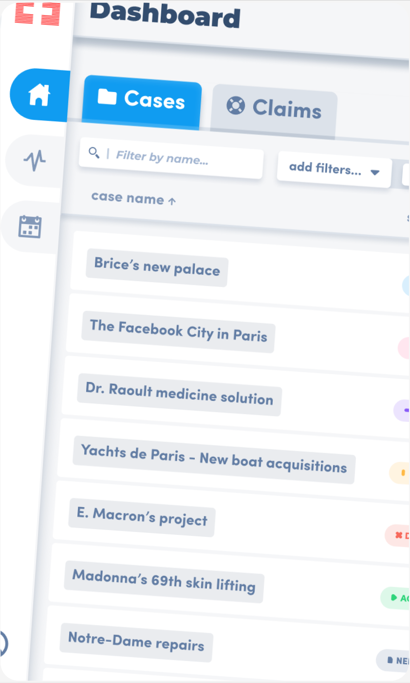
Designed a SaaS platform to digitize insurance workflows for major infrastructure projects.
Client
International enterprise clients spanning the EU and US markets.
Context
- 3-month project (COVID era)
- Operated in a market with no established standards.
- Built a single platform capable of adapting to highly diverse client requirements.
Brice
”
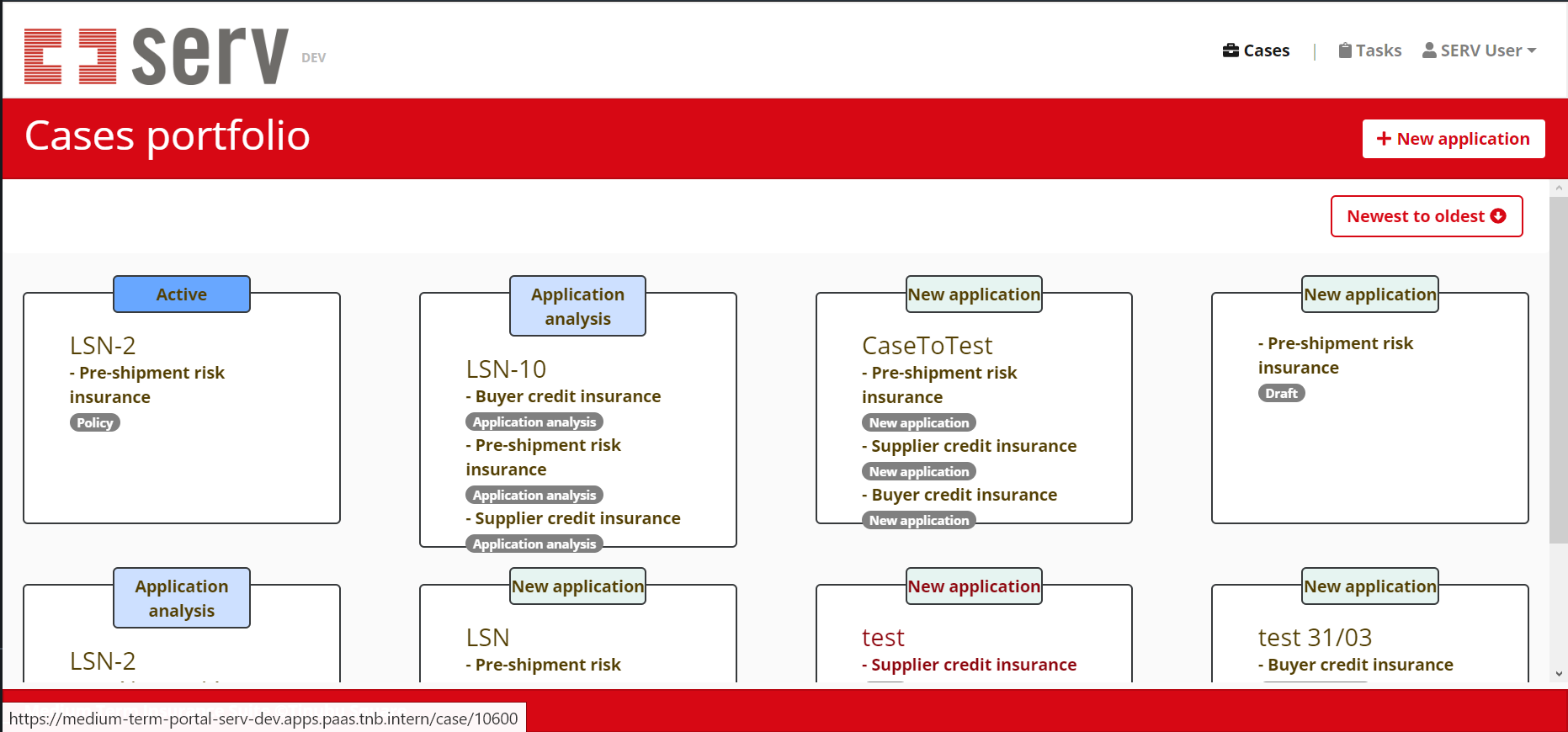
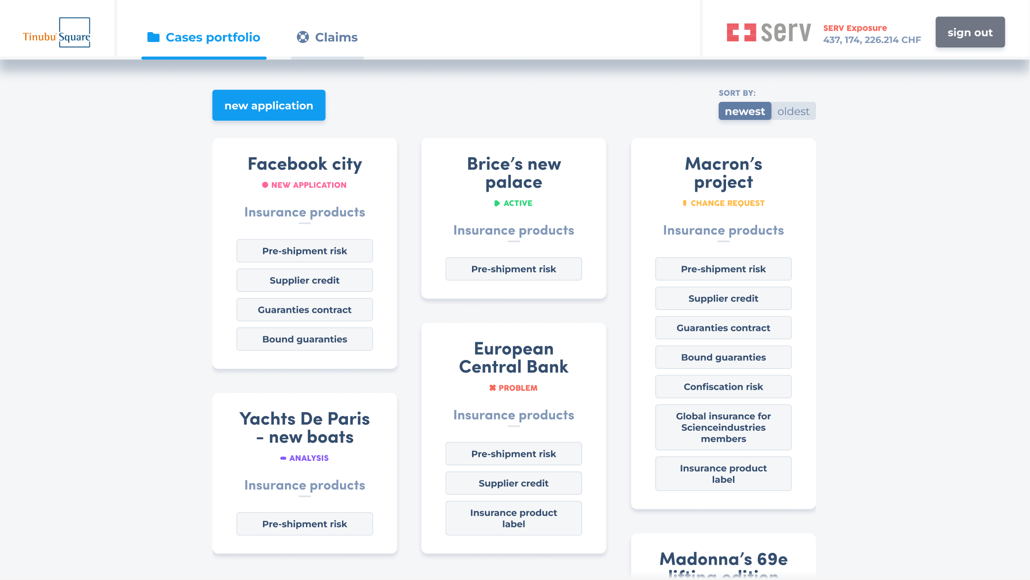
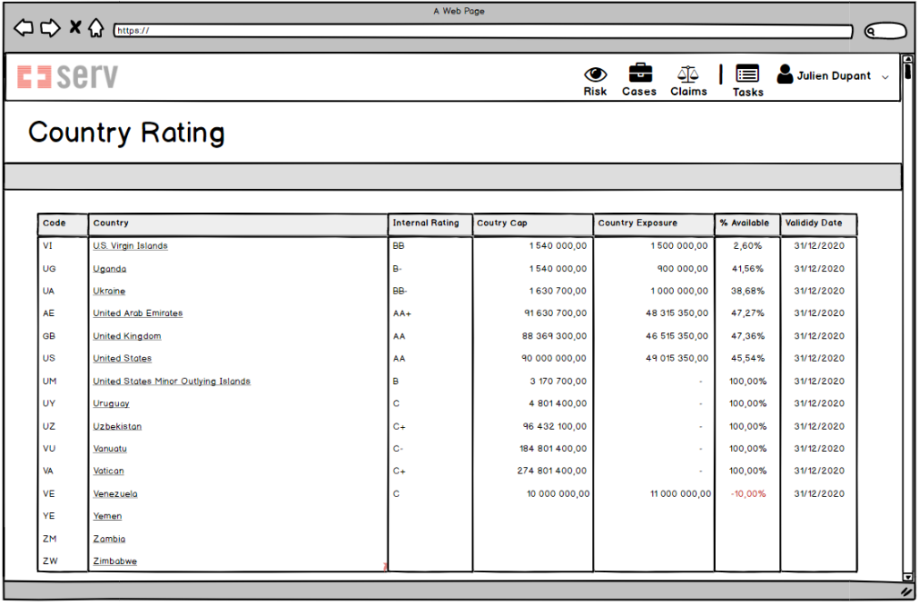
Before my arrival, non‑design sales teams collaborated with several clients to approve mock‑ups that served as the initial UI concept.
Brice
”
Client interviews revealed a clear desire to move beyond the traditional "numbers and text on paper" aesthetic. Stakeholders were eager to introduce playful, engaging elements into a tool they'd use daily.
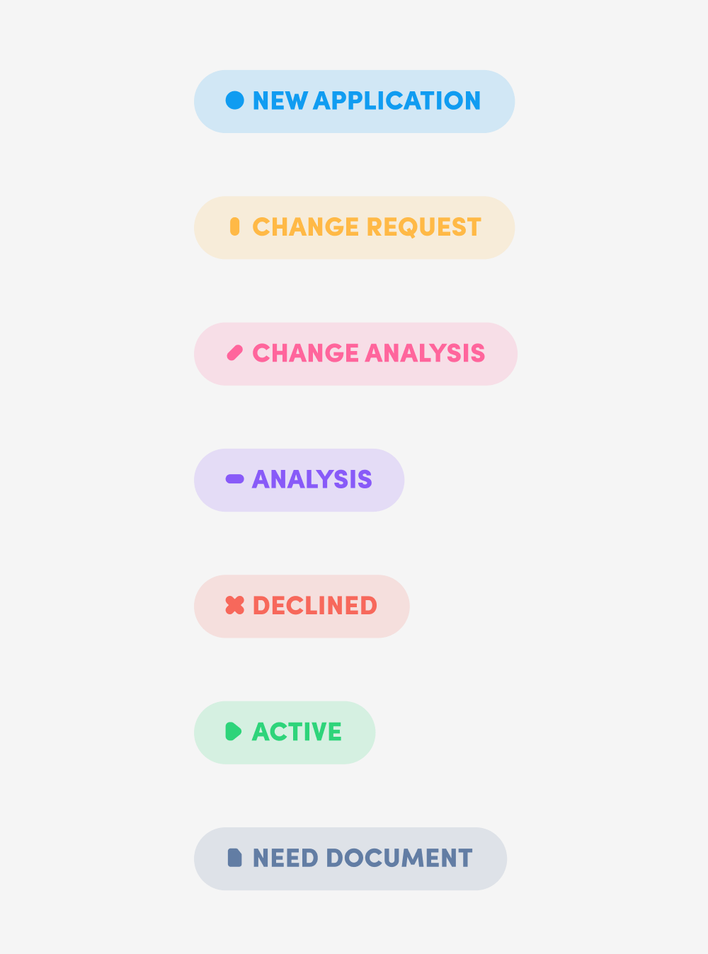
Case status emerged as a key opportunity. As critical information in their daily workflow, it needed to be instantly recognizable.
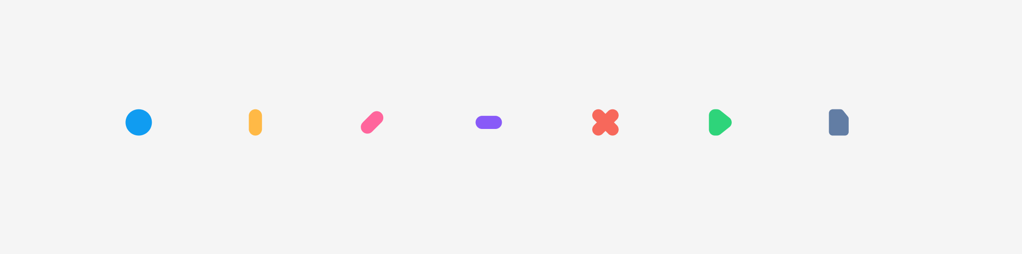
I developed a simple, intuitive visual language to address this.
Brice
”
- The dot to catch attention.
- A vertical line as a raised hand for the change request.
- A diagonal line for a change of work.
- An horizontal line for something currently being done and that we need to wait to be finished.
- The cross, the play and the document icon using already known patterns.
Brice
”
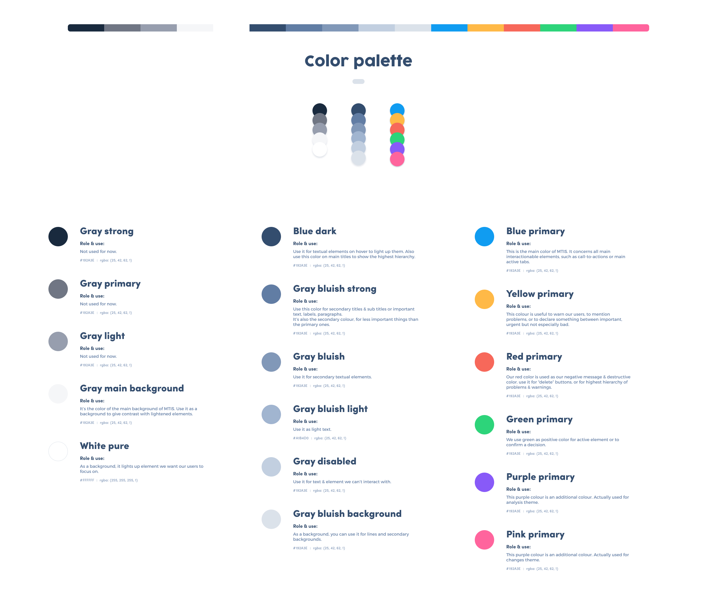
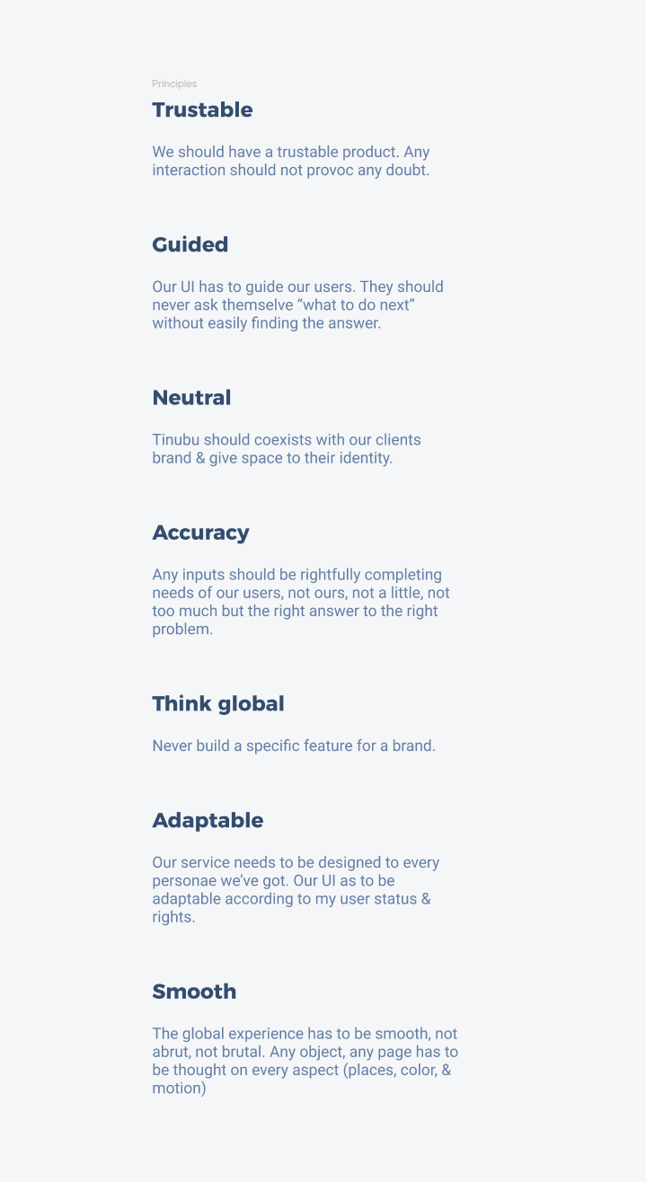
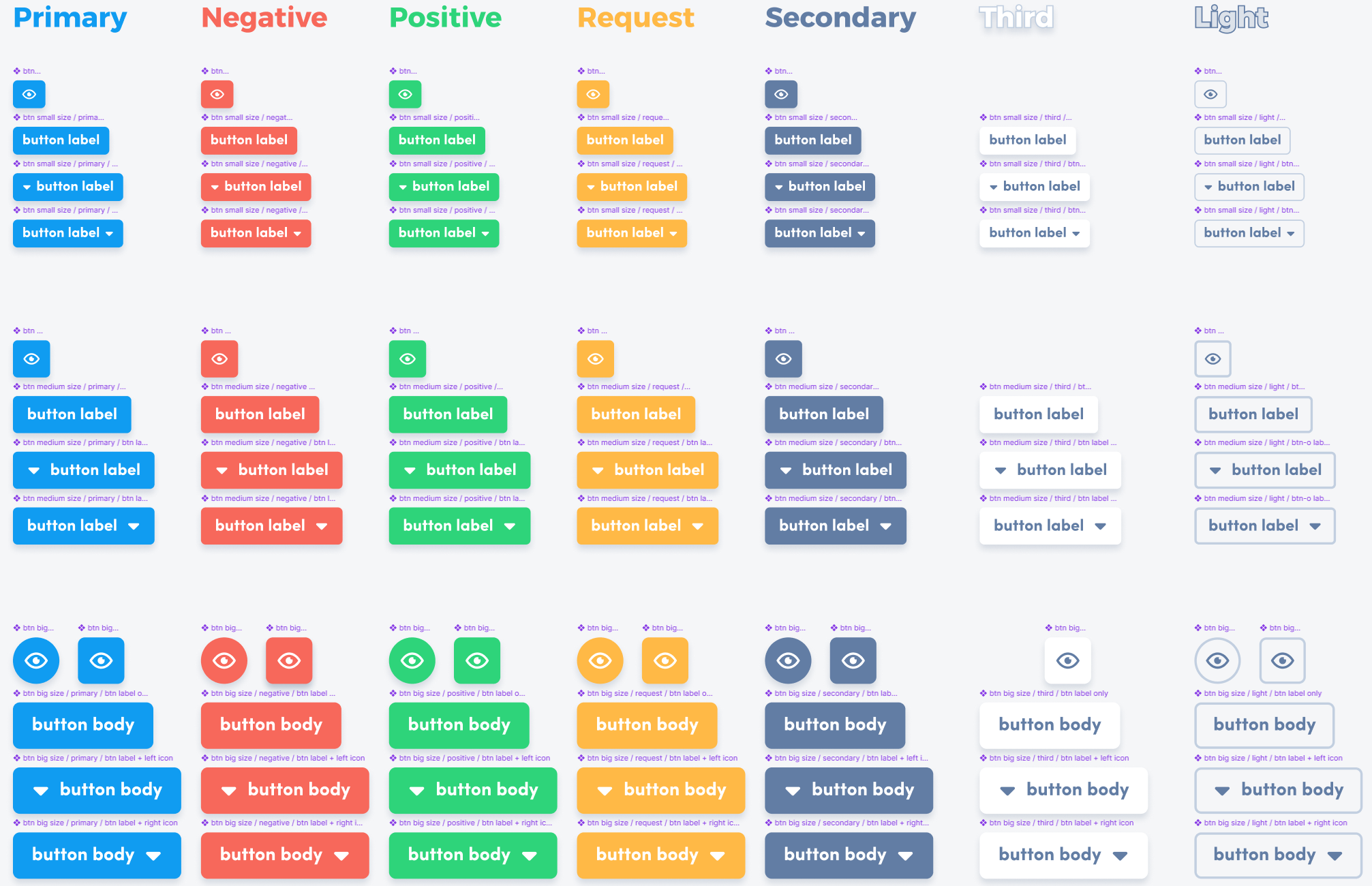
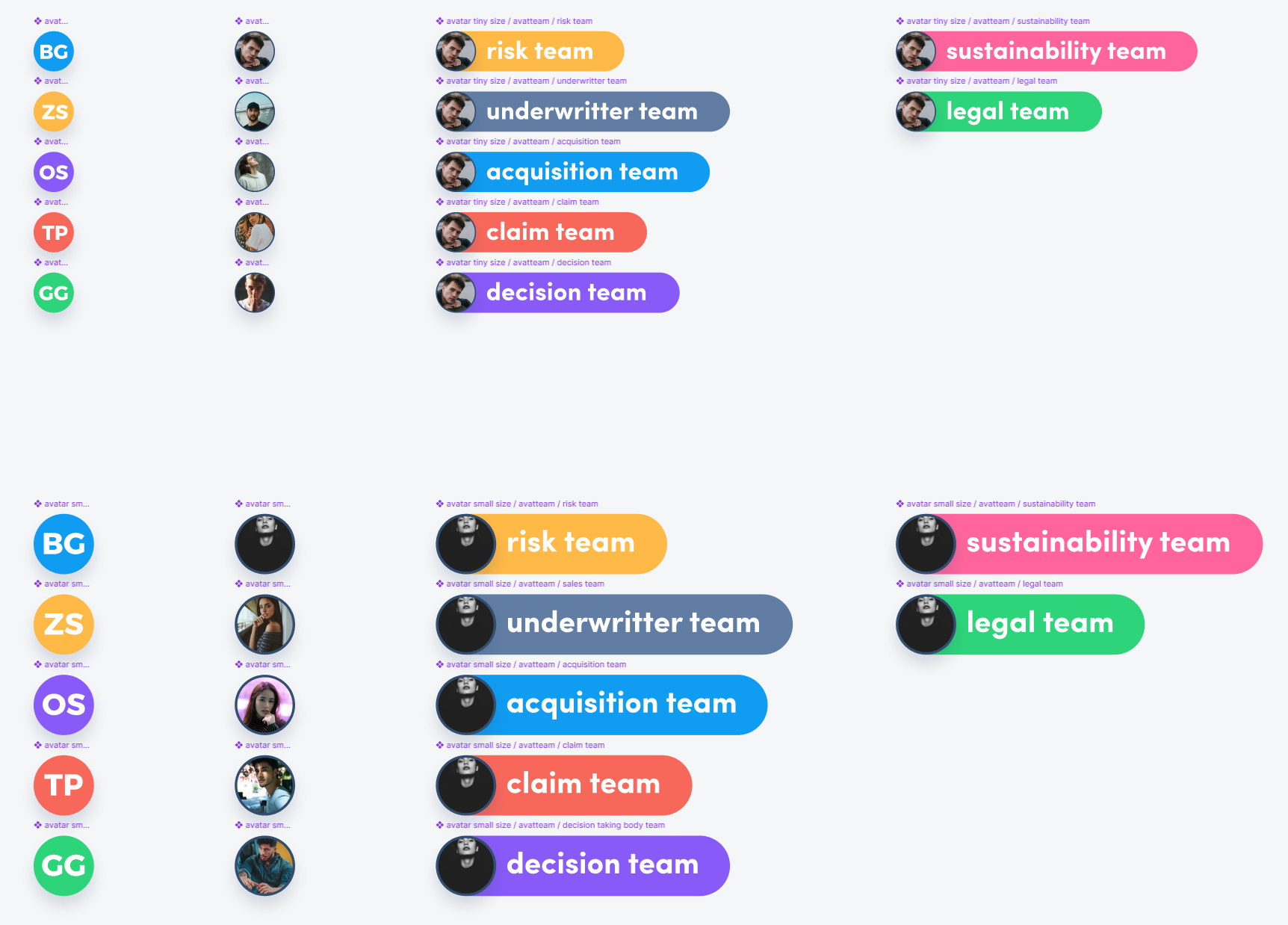
Anticipating an early departure due to COVID‑19, I empowered all Product Owners with a comprehensive toolkit supported by a custom design system—enabling them to maintain autonomy throughout the creative process.
Brice
”
By integrating the UI library into mock‑ups, I helped clients visualize daily workflows more clearly—contrasting the new interface with their established routines.
Brice
”
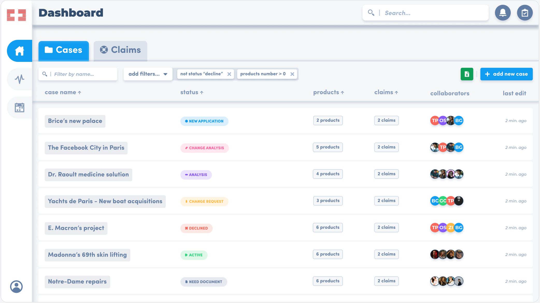
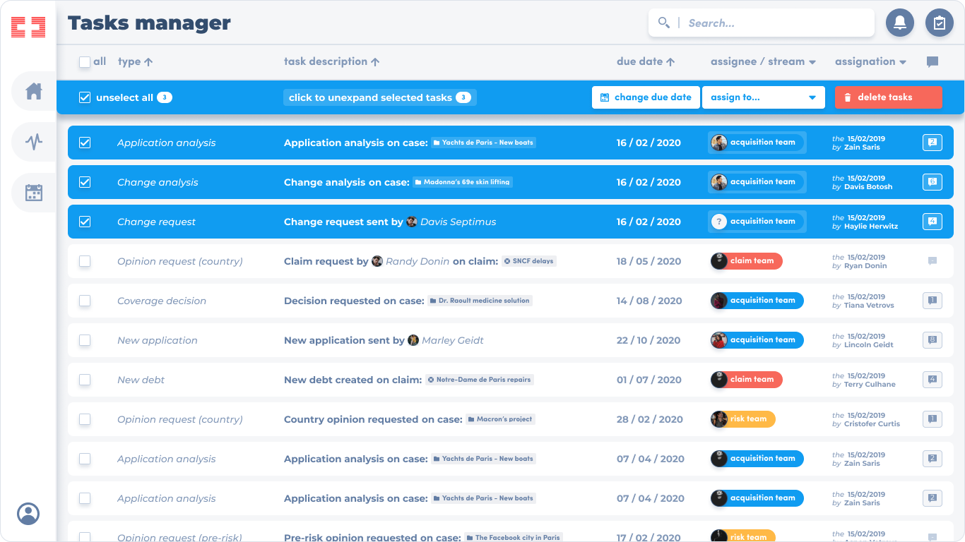
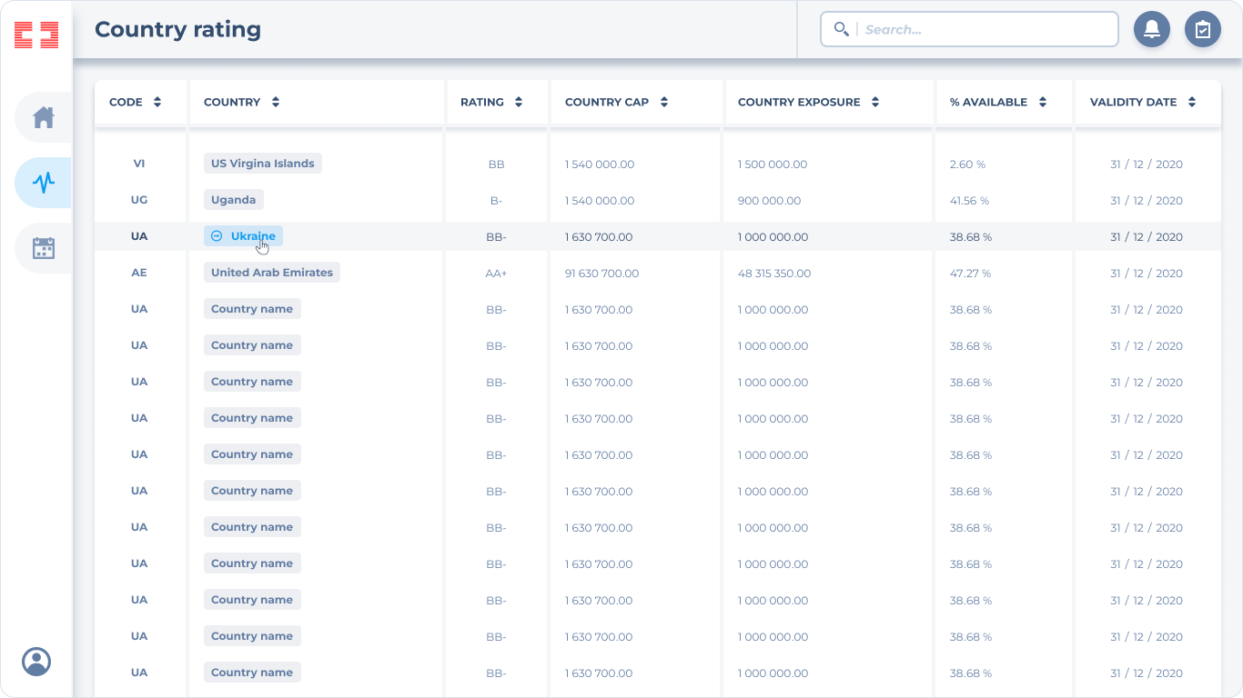
Through interactive prototypes, clients expressed a need for more on‑screen feedback.
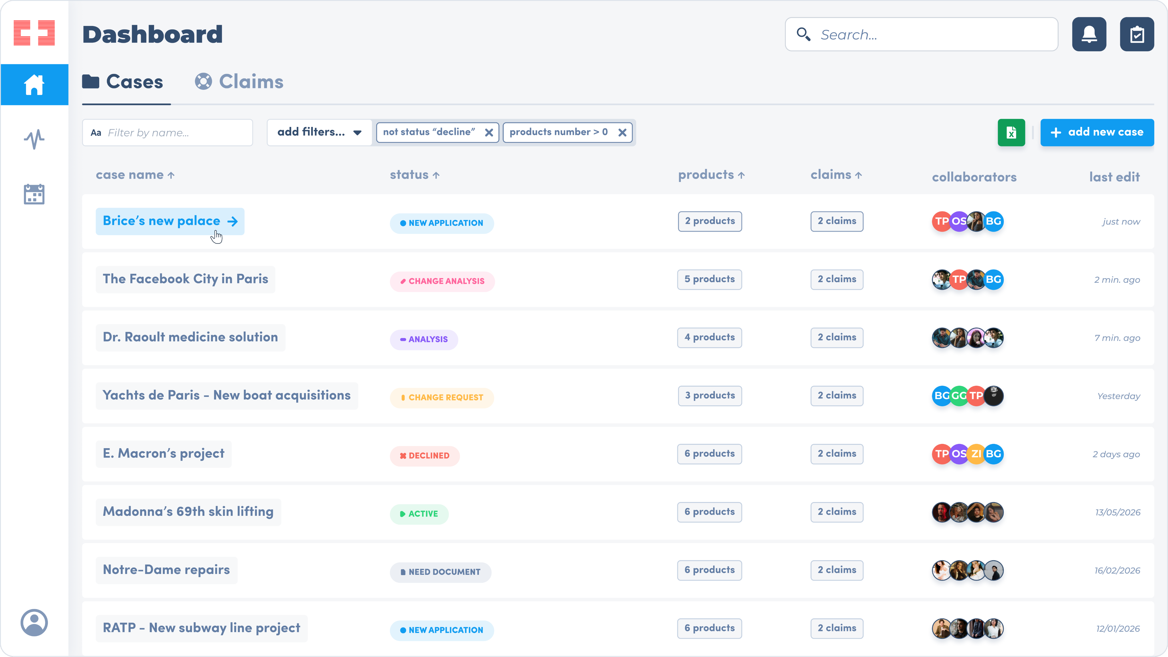
I delivered a table‑oriented solution aligned with their existing habits. The response was overwhelmingly positive—particularly for the hover micro‑interactions that preserved quick access to information while optimizing screen real estate.
If I had to make little UI adjustment in 2026:
Brice
”
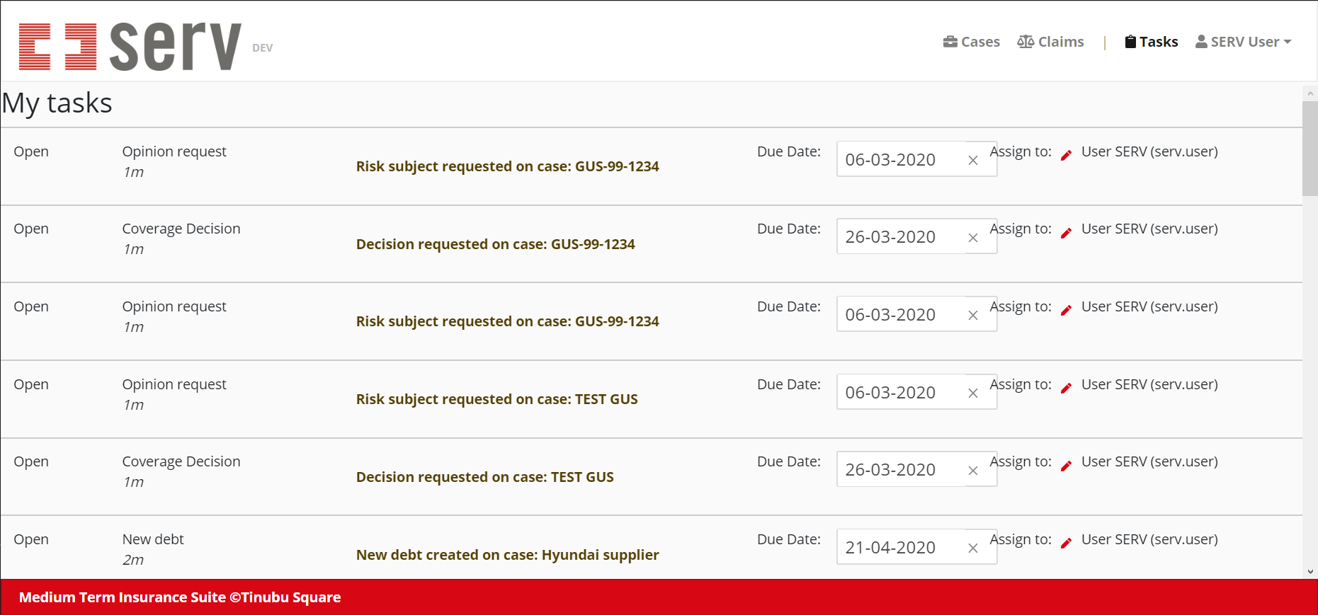
Because clients embraced the SaaS’s direction, we proceeded with this approach.
Brice
”
If you’d like to view additional prototypes or discuss any design decisions, please feel free to contact me.
email me

My resume

Available now

Available now
SaaS Platform
Back
Mission
Designed a SaaS platform to digitize insurance workflows for major infrastructure projects.
Client
International enterprise clients spanning the EU and US markets.
Context
- 3-month project (COVID era)
- Operated in a market with no established standards.
- Built a single platform capable of adapting to highly diverse client requirements.
Brice
”
Before my arrival, non‑design sales teams collaborated with several clients to approve mock‑ups that served as the initial UI concept.
Brice
”
Anticipating an early departure due to COVID‑19, I empowered all Product Owners with a comprehensive toolkit supported by a custom design system—enabling them to maintain autonomy throughout the creative process.
Brice
”
Client interviews revealed a clear desire to move beyond the traditional "numbers and text on paper" aesthetic. Stakeholders were eager to introduce playful, engaging elements into a tool they'd use daily.
Case status emerged as a key opportunity. As critical information in their daily workflow, it needed to be instantly recognizable.
I developed a simple, intuitive visual language to address this.
Brice
”
- The dot to catch attention.
- A vertical line as a raised hand for the change request.
- A diagonal line for a change of work.
- An horizontal line for something currently being done and that we need to wait to be finished.
- The cross, the play and the document icon using already known patterns.
Brice
”
By integrating the UI library into mock‑ups, I helped clients visualize daily workflows more clearly—contrasting the new interface with their established routines.
Brice
”
Through interactive prototypes, clients expressed a need for more on‑screen feedback.
I delivered a table‑oriented solution aligned with their existing habits. The response was overwhelmingly positive—particularly for the hover micro‑interactions that preserved quick access to information while optimizing screen real estate.
If I had to make little UI adjustment in 2026:
Brice
”
Because clients embraced the SaaS’s direction, we proceeded with this approach.
Brice
”
If you’d like to view additional prototypes or discuss any design decisions, please feel free to contact me.
email me
My resume